There’s been a lot of buzz about adding creative flair to resumes lately. Using bright colors, icons, infographics, and out-of-the-box layouts to break the monotony of text-heavy, conventional formats, and make applications stand out from other candidates.
And the reasoning behind this trend is understandable. With competition for roles intensifying, presentation has become a key factor in how candidates position themselves.
That’s why a resume is no longer viewed simply as a document of work history, but as an introduction to one’s professional brand. As a result, more job seekers are turning to creative layouts to highlight their capabilities distinctively.
But here’s the catch: while these designs might grab attention, they can also backfire. Some recruiters see them as distracting. Many applicant tracking systems (ATS) struggle to read them. Which raises the big question: does a creative resume help you, or could it actually hurt your chances?
In this blog, we’ll break down the pros and cons of creative resumes, share best practices, and help you decide when this approach might work best for you.
What is a creative resume format?
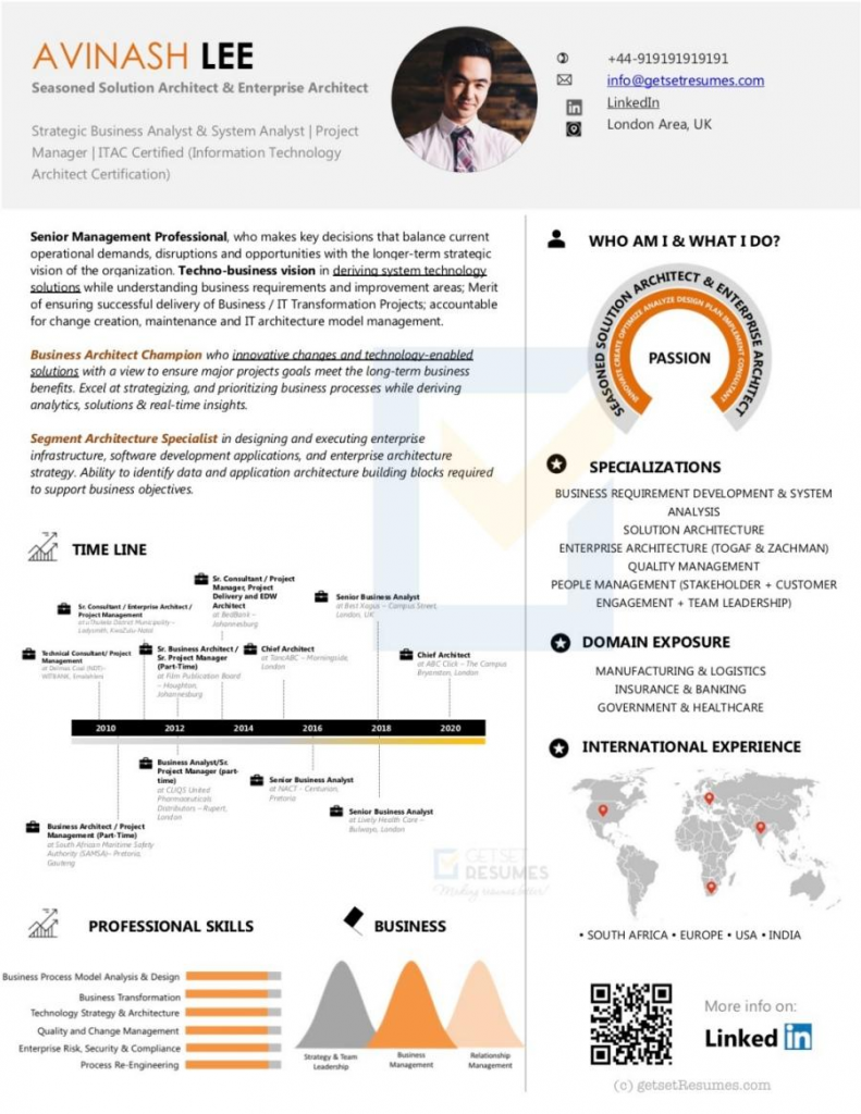
A creative resume combines professional content with innovative design to make a memorable impression. It uses visual storytelling through timelines, skill meters, portfolio previews, and branded color palettes. This format helps candidates in creative industries showcase both their qualifications and design abilities. However, the key is balancing visual appeal with readability and including all essential information like experience, education, skills, and achievements in an organized, professional manner that still passes ATS.

The Appeal of Creative Resume Formats
Although creative resume designs may initially appear to be an effective way to differentiate yourself, but they often generate more challenges than advantages. Let’s look at some of the common drawbacks job seekers overlook, which, in turn, can quietly weaken their job search and reduce recruiter interest.
They confuse ATS
According to a comprehensive survey, an astonishing 99.7% of recruiters use applicant tracking systems to filter candidates. These software systems analyze resumes before they ever reach a hiring manager.
Unfortunately, many applicant tracking systems (ATS) softwares are completely unable to read special characters and content contained in:
- Text boxes or sections with shading
- Areas with borders, lines, or colored backgrounds
- Graphics or images containing important text
Consequently, even if you’re perfectly qualified for a position, your resume might be automatically rejected simply because the ATS couldn’t properly parse your information due to background formatting issues.
They distract from your actual qualifications
Hiring professionals typically spend as little as six seconds scanning each resume for important information. So during this brief window, anything that complicates their review process works against you.
Lack of hierarchy, overuse of colors, tiny or fancy fonts, excessive graphics or icons and inconsistent formatting makes recruiters work harder to identify your skills, job titles, and accomplishments. And no recruiter won’t invest additional time to decipher a resume when plenty of clean, easy-to-read alternatives are available.
The goal is immediate clarity.
They cast doubt on professional judgment.
An overly decorated resume often raises uncomfortable questions in the recruitre’s mind. As one hiring professional bluntly stated, “When I see a colored background or ‘cute’ fonts in a résumé, my immediate reaction is, ‘What is this person trying to distract me from? What are they hiding?’
Too much emphasis on visual presentation rather than substance might lead employers to wonder if you’re attempting to compensate for inadequate experience or qualifications. In addition, it may suggest you don’t understand professional norms or lack the judgment to distinguish between appropriate creative expression and workplace standards.
Unless you’re applying for specific creative roles, a resume often communicates the wrong message about your priorities and professional awareness, precisely the opposite effect most job seekers intend.
So when do creative resumes work best ?
Before using a creative resume, the first step is knowing when it’s actually a good idea. Not all jobs are suitable for creative formats. Below are three roles where a creative resume works best to help you stand out and get noticed by recruiters.
1. Design and visual arts roles
Creative resumes are essential for professionals in visual fields because their resume itself acts as a real demonstration of their design skills. Creative resumes are typically welcomed in:
- Graphic designers and visual artists
- Web and UI/UX designers
- Photographers and videographers
- Fashion industry professionals
- Theater and acting professions (entertainment industry)
2. Marketing and advertising positions
Creative resumes work well for marketing and advertising professionals because these roles require understanding visual communication principles.
- Advertising and sales specialists
- Marketing communications professionals
- Content creators and copywriters
- Brand development experts
- Social media strategists
3. Startups and creative agencies:
Startup culture embraces innovation in all forms, including resume design. Creative resume can work well when applying to:
- Tech startups and innovative companies
- Creative agencies and studios
- Forward-thinking digital businesses
- Organizations with experimental approaches
Regardless of which creative field you’re targeting, remember that your resume should always:
- Complement your qualifications rather than distract from them
- Match the tone and feel of your target industry
- Remain subtle enough to maintain readability
- Include a plain-text version as a backup
The key to successfully using a creative resume lies in understanding your industry, and its visual standards, creative norms, and brand culture. When in doubt, research the company’s visual branding and culture before deciding on your resume design approach.
5 Tips for using a creative resume wisely
If you’re determined to use a creative resume, implementing it correctly makes all the difference. It boils down in finding the perfect balance between visual appeal and professional functionality.
Tip 1: Keep it subtle and minimal
Tip 2: Use light patterns or soft colors
Tip 3: Avoid infographics and heavy visuals
Tip 4: Test readability with the six-second scan
Tip 5: Use layout and spacing for visual appeal
Conclusion
Resume design is about strategic communication, not just artistic expression. The best resume format depends on your target role. Standard industries favour traditional layouts that showcase qualifications without distractions. While creative fields welcome design elements that not only demonstrate relevant skills but also readability for the hiring managers.
The thing is, professional resume design ultimately comes down to functionality.
The next time you feel tempted to add that colourful background or decorative element, ask yourself: “Does this help or hinder a hiring manager’s understanding of my qualifications?” This question alone might save your resume from unnecessary rejection. After all, your experience and accomplishments deserve centre stage.